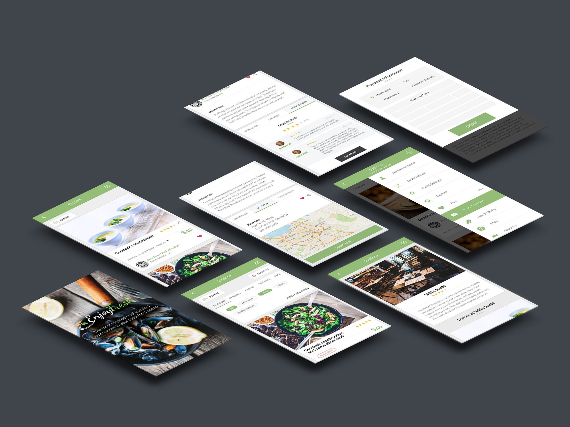
I was hired by EnjoyFresh to help improve the design and user experience of their customizable dashboard app that let's user book and experience curated, personalize foodie experience.
Curated food experiences personalized for you
Customer Journey Map
Sitemap
UI Mockups
Invision Prototype
Stakeholder Discussion
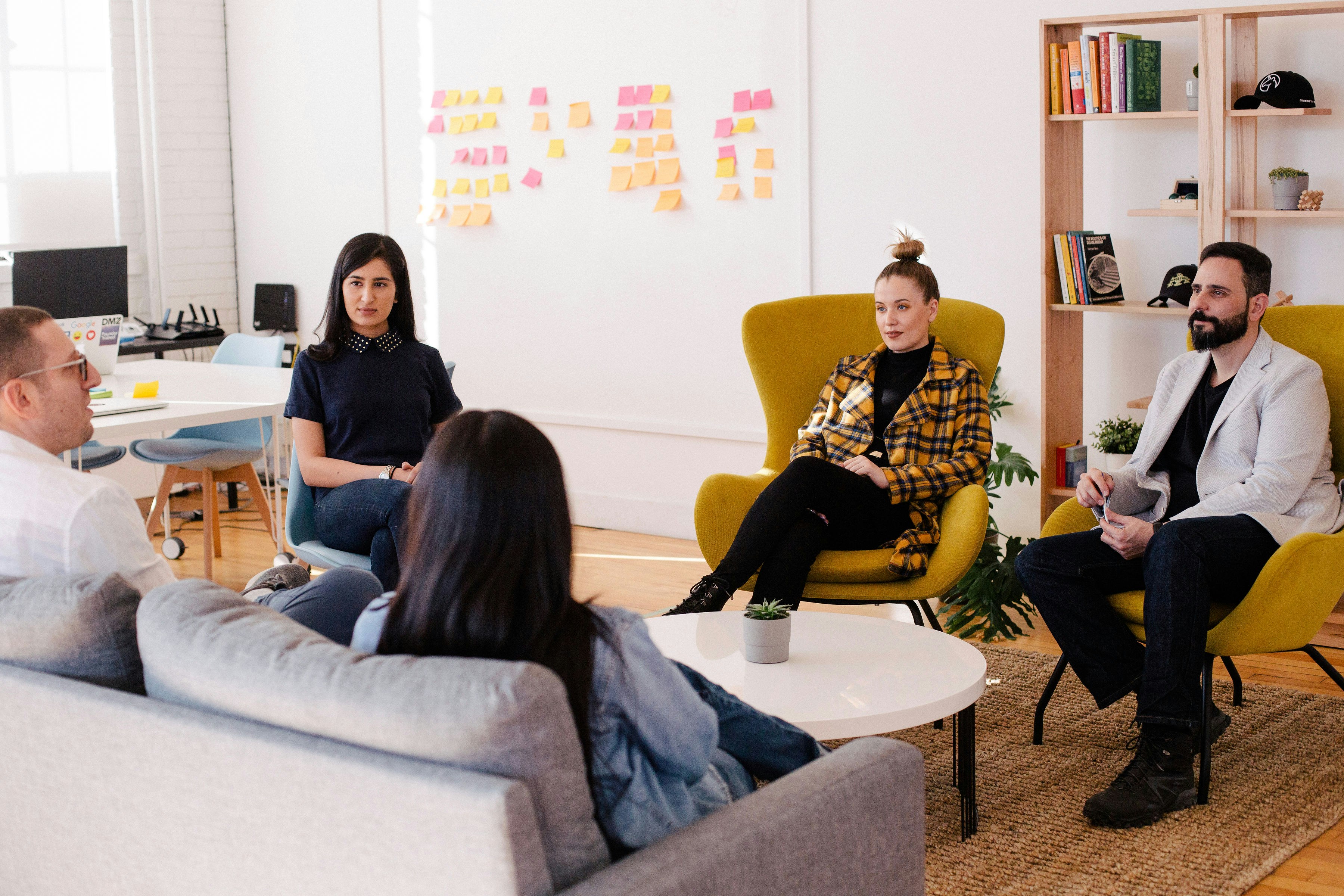
I needed to understand the companies business objectives, key metrics and target market. So I create a survey that asked them to clarify and put into common terms exaclty what their vision and problesm are so that we could use it as a reference as a team as always be on the same page.
Their users are installing the app but not engaging
Engagement
They have a lot of free signups but users are not upgrading to the paid plan
Free to Paid Conversions
Their traffic is not very high
Traffic to Conversion Ratio
Site redesign to improve user experience and map better to customer journey
App walkthrough to during onboarding to elimate confusion and each customer into the process
Planning and priority of features
Analyzing the existing customer journey to find opportunities for improvemen
UX Research Phase
We needed to get clear on the mental model of our target market and understand what they were having trouble accomplishing from both an informational side and a functional side. I also wanted to understand more deeply the customer joureny and transformation that they were looking to achieve in terms of a solution.

Quantitative research findings
Qualitative survey and interview findings
Results and Insights: The user is dropping off during the onboarding process due to overwhelm and confusion.
Inspiration and Mood Board
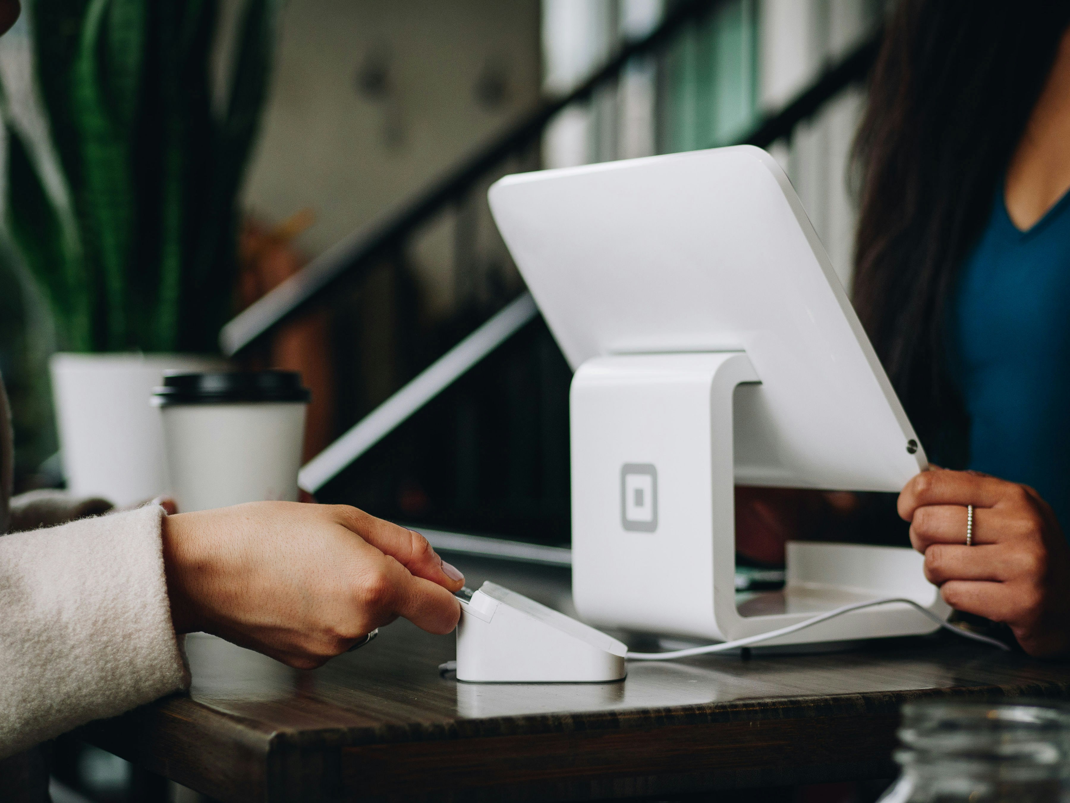
Blue tones and imagery that represent business, connection, point of sale and digital customer experience
UI Redesign
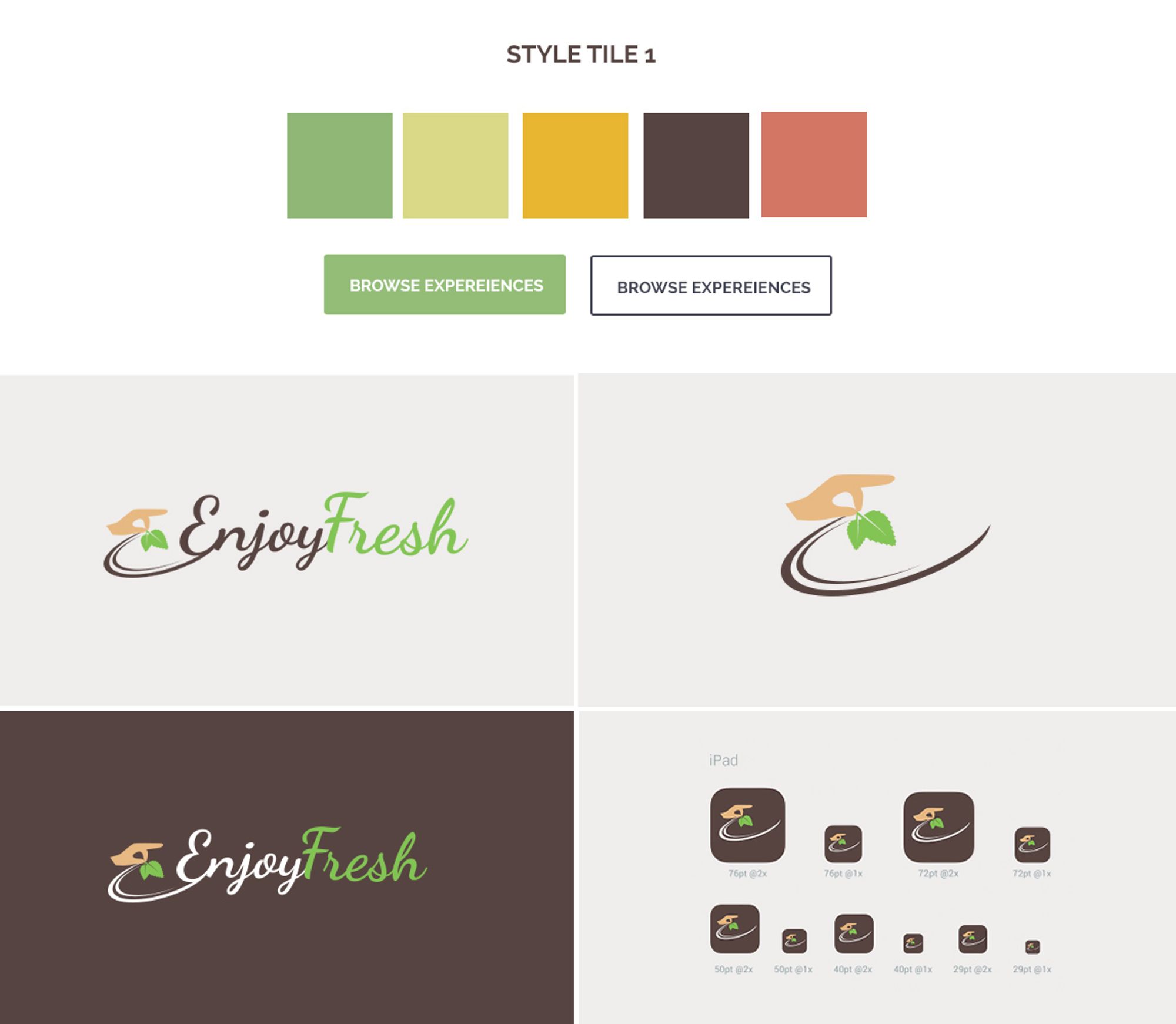
I completed overhauled each existing screen with the new branding

Prototype
I created interactive prototype for each iteration which we testing with our participants and customers to gain feedback and insight
Testing was conducted during the discovery phase to identify the biggest pain points in the current version. During the redesign: Testing was done at every milestone of the project. Invision prototypes were shared with stakeholders to get early feedback. After numerous surveys and user pilots, we launched the platform in June 2017 for our partner clients.
The redesign resulted in improved visual heirarchy and a refactoring of CSS increase google page ranking by 100%. Signup page conversion increase and a fully redesigned onboarding process and better UX to alow the user to connect and input complex 3rd party integrations with ease.
Stakeholder testimonials


"Liz really understands the nuances behaviour of the foodie population and is able to clearly translate that to design that impact our customer and business positively. She is amazing at staying calm under pressure and delivering while keeping everyone happily on the same page. Thankful for the work she's done for us!"
Daniel Cranes, CEO
"Liz really understands the nuances behaviour of the foodie population and is able to clearly translate that to design that impact our customer and business positively. She is amazing at staying calm under pressure and delivering while keeping everyone happily on the same page. Thankful for the work she's done for us!"
Jung Tang, CTO
